A siding color that looks crisp on a sunny showroom sample can read completely differently on an actual Southwest Washington home, most of the year, under our region's soft, overcast light. Direct sun saturates color and creates strong shadow lines; the diffuse, cloud-filtered light common here flattens both, which means color selection deserves a slightly different approach than it would in a sunnier climate.
James Hardie's ColorPlus factory-finish system offers a wide range of tones through its Statement and Dream Collection palettes. This guide isn't about which colors are trendy — it's about which tones and pairings actually read well under the light Vancouver, Camas, and the rest of Clark County get for most of the year.
It's also worth separating a color's appearance on a rare sunny Southwest Washington afternoon from how it looks on a typical day. A color that looks striking in July sun needs to hold up equally well on a flat, gray February morning, since that's the lighting condition your siding will actually wear for the majority of the year here.
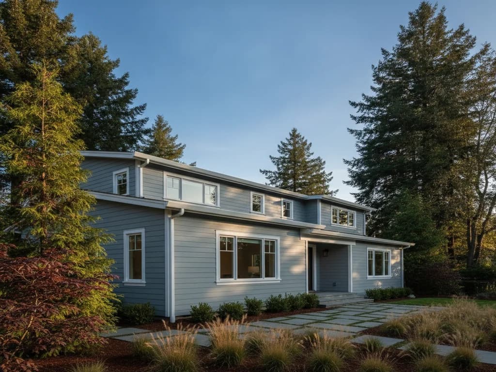
Deep, saturated tones — charcoal grays, deep blues, forest-adjacent greens — tend to hold their richness under overcast light better than pale, chalky colors, which can look washed out and flat without direct sun to give them depth. That's part of why deep gray and blue-based siding colors have become so common across newer Clark County construction; they're not just trend-driven, they photograph and read well in our actual weather.
Warmer neutrals — greiges, warm taupes, and soft creams — also perform well here because they don't rely on bright sun to look intentional; they read as warm and grounded even under gray skies. The colors that struggle most in our climate tend to be very pale, cool-toned whites and light pastels, which can look flat or slightly dingy without strong sunlight to give them contrast.
General guidance, not a rule — architecture, neighborhood context, and your own taste all factor into the right color for your home.
Trim and accent color do a lot of the work under diffuse light, since they're often what creates visual contrast and depth when the sun itself isn't providing it. A crisp white or black trim against a deep-toned field color reads clearly year-round here, while a body and trim color that are too close in value can blur together on an overcast day, losing the architectural definition trim is supposed to provide.
We typically recommend viewing color and trim samples outdoors, in our actual light, before finalizing a selection — a sample viewed indoors under artificial light, or even outdoors on one of our rare bright days, can read differently than it will on a typical gray Tuesday in February.
James Hardie's ColorPlus technology applies color in a factory setting under controlled conditions, rather than relying on field painting after installation. That matters in our climate specifically: field-applied paint has to cure properly, which is harder to guarantee during a wet Pacific Northwest install season, and a factory finish is backed by its own separate finish warranty.
It also means the color you select from a Statement or Dream Collection sample is the color that gets manufactured and installed — not a field-mixed approximation dependent on weather conditions during application.
For homeowners in an HOA or with strict neighborhood design guidelines, working from the standard ColorPlus palette also simplifies approval, since the colors are documented, consistent, and easy to reference in a submittal — rather than a custom-mixed field color that can vary slightly from batch to batch.